前端- css layout
前端- css layout
Before the Flexbox Layout module, there were four layout modes:
- Block, for sections in a webpage
- Inline, for text
- Table, for two-dimensional table data
- Positioned, for explicit position of an element
Flexbox
<div class="flex-container"> |
** display: flex;**

flex direction
defines in which direction the container wants to stack the flex items.
column - from top to bottom
row - from left to right
flex wrap
The flex-wrap property specifies whether the flex items should wrap or not.
order
The order property specifies the order of the flex items.
flex grow 、 shrink
<div class="flex-container"> |

flex basis
TThe order property specifies the order of the flex items.
flex
The flex property is a shorthand property for the flex-grow, flex-shrink, and flex-basis properties.
<div class="flex-container"> |

grid
display: grid;
<div class="grid-container"> |
grid-template-columns
The grid-template-columns property defines the number of columns in your grid layout, and it can define the width of each column.
grid-template-rows
The grid-template-rows property defines the height of each row.
grid-column
The grid-column property defines on which column(s) to place an item.
.item1 { |
Make "item1" start on column 1 and end before column 5:
grid-row
The grid-row property defines on which row to place an item.
.item1 { |
Make "item1" start on row-line 1 and end on row-line 4
grid-area
The grid-area property can be used as a shorthand property for the grid-row-start, grid-column-start, grid-row-end and the grid-column-end properties.
.item8 { |
Make "item8" start on row-line 1 and column-line 2, and end on row-line 5 and column line 6:

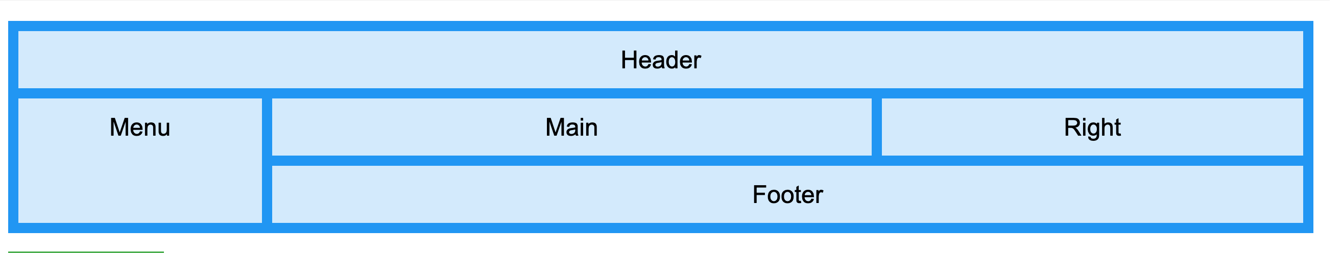
Getting Started With CSS Layout https://www.smashingmagazine.com/2018/05/guide-css-layout/
Grid Vs Flexbox: Which Should You Choose? https://www.webdesignerdepot.com/2018/09/grid-vs-flexbox-which-should-you-choose/
https://css-tricks.com/snippets/css/complete-guide-grid/ https://css-tricks.com/snippets/css/a-guide-to-flexbox/ https://www.w3schools.com/css/css3_flexbox.asp https://www.w3schools.com/css/css_grid.asp